
Stop Building Digital Junk Drawers and Start Building High-Performance Cockpits
Look, I’m going to be completely honest: most business dashboards are a total disaster. They are a mess of colorful charts that don’t actually tell you anything, navigation menus that feel like a scavenger hunt, and "features" that nobody ever uses. I’ve seen founders spend a fortune on [Web Application Development] only to have their internal team go back to using Excel spreadsheets because the "pro" tool was too confusing. It is a massive waste of capital and a total productivity killer.
The truth is, SaaS Dashboard & Web App Design is about managing complexity. It is about taking a mountain of data and turning it into a single, actionable insight. Most agencies want to sell you a "pretty" interface. At DesklaGo, we build interfaces that work as hard as your developers do. We focus on "Cognitive Load"—the amount of mental effort it takes to use your tool. If your users are frustrated, they’ll churn. If they’re efficient, they’ll stay forever. No fluff, no "over-designed" charts—just elite enterprise engineering.
1. The "Data Dumping" Trap: Why More Isn’t Better
Most designers think that "more data" on a screen makes a dashboard look more professional. Honestly, it’s the opposite. If I have to look at twenty different graphs to figure out if my business is healthy, the design has failed. I’ve seen enough "cluttered" enterprise tools to know that "Visual Noise" is the #1 reason users abandon a SaaS product.
We focus on the "Signal-to-Noise Ratio." We identify the one or two "North Star" metrics that your users actually care about and make them the hero of the screen. Everything else is secondary. According to the Nielsen Norman Group, complex systems must prioritize "Discoverability" over "Display." We don't just dump data; we curate it so your users can make decisions in seconds, not hours.
2. Progressive Disclosure: Power Without the Chaos
A common mistake in SaaS Dashboard & Web App Design is trying to show every single feature at once. It’s overwhelming. Imagine if the cockpit of a 747 showed every single warning light at all times. The pilot wouldn't be able to fly. You need a system that hides complexity until it is actually needed.
We use "Progressive Disclosure" to keep the interface clean. We hide the "advanced" settings and the "deep-dive" reports behind logical clicks. This makes the tool feel simple for new users while remaining powerful for the "power users." Whether you are building a CRM or a custom [Back Office Support] tool, we ensure the interface grows with the user’s skill level. It is about building a tool that feels light but hits heavy.
Need Immediate Assistance?
Our elite virtual assistants are ready to take over your inbox, calendar, and daily operations so you can get back to what actually matters-scaling your revenue.
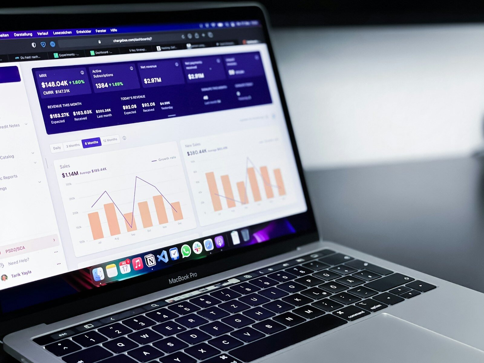
3. Data Visualization: Charts That Actually Speak
Most "dashboard templates" give you generic pie charts and bar graphs that look nice but mean nothing. If your chart doesn't tell the user what to do next, it is just a decoration. I’ve seen enough "pretty" lines that didn't help a single manager make a better choice.
We engineer custom Data Visualizations. We look at the "So What?" behind the numbers. If a metric is down, we use color and scale to highlight the problem and provide a path to fix it. We design for clarity over "flashiness." We use D3.js logic to ensure that your data is represented accurately and intuitively. Your dashboard shouldn't just be a report; it should be a roadmap for your business growth.
4. The "Admin Tool" Myth: Why Internal Design Matters
There is a dangerous belief that "internal tools" or "admin panels" don't need to look good because "the staff has to use them anyway." This is a total lie. If your team is fighting with a clunky, slow, and ugly interface every day, their morale and their speed will drop. I’ve seen companies lose their best talent because the internal software was a nightmare to use.
Our SaaS Dashboard & Web App Design services treat your team like premium users. We bring the same level of [UI/UX Design] polish to the backend that we bring to the frontend. We focus on "Frictionless Workflows"—reducing the number of clicks it takes to complete a task. When your admin tools are fast and beautiful, your business moves faster. It’s that simple.
5. The DesklaGo Dashboard Blueprint
We do not believe in "guessing" what your users need. Engineering a high-performance enterprise tool requires a methodical, data-driven approach. Here is exactly how we take your complex logic and turn it into a streamlined dashboard.
-
Step 1: The Logic & Persona Audit. We interview your power users. We find the "pain points" in their current workflow and identify the most frequent tasks they perform.
-
Step 2: Information Architecture & Wireframing. We map out the "Skeleton." We focus on the hierarchy of data and the navigation flow. We solve the logic puzzles before we ever touch a color palette.
-
Step 3: Component-Based UI Design. We build a "Design System." We create reusable buttons, tables, and charts that ensure your [Web Application Development] stays consistent as you add new features.
-
Step 4: Interactive Prototyping. We build a clickable version in Figma. We test the transitions and the data-drill-down logic to ensure it feels "snappy" and intuitive.
-
Step 5: Developer-Ready Handoff. We provide the full specs, including the CSS variables and the asset exports. We make sure your developers have everything they need to build the design to a pixel-perfect standard.
6. Accessibility & Dark Mode: The Professional Standard
In 2026, if your SaaS doesn't have a "Dark Mode," you are behind. Professional users—developers, traders, and managers—often spend 10+ hours a day looking at their screens. High-contrast light modes cause eye strain and fatigue. I’ve seen enough "headache-inducing" dashboards to know that "Dark Mode" is a requirement, not a feature.
We build with "Universal Accessibility" in mind. We follow the WCAG 2.1 standards to ensure your tool is usable by everyone, including those with visual impairments. We use high-contrast text, keyboard-friendly navigation, and logical focus states. Whether it is a [SaaS Dashboard Design] or a public-facing app, we ensure it is built for long-term, professional use without the "technical debt" of an inaccessible interface.
Ready to Delegate?
DesklaGo provides proactive, strategic virtual assistance that seamlessly integrates into your workflow. Let us handle the noise while you focus on the vision.
7. Why Strategic Dashboard Design is a Valuation Multiplier
At the end of the day, your SaaS product is judged by its "Usability." If an investor logs in and sees a confusing mess, they see a "churn risk." If they log in and see a clean, powerful, and intuitive interface, they see a scalable asset. High-end design is the fastest way to increase your MRR (Monthly Recurring Revenue).
A DesklaGo dashboard project is an investment in your company’s "Professional Equity." It makes your product look like it belongs in the hands of a Fortune 500 company. It reduces your training costs and increases your customer lifetime value. We don't just want to give you "cool" charts; we want to build the command center that makes your company indispensable. No fluff, just high-performance enterprise design.

Stop Fighting Your Own Software
If your current dashboard is a headache, it is a liability. You can either keep wondering why your users aren't taking full advantage of your features, or you can build a professional experience that empowers them.
We aren't here to give you "creative concepts" that don't translate to real-world productivity. We are here to build the interfaces that power your growth. If you’re ready to stop the clutter and start the clarity, let’s get to work.